If you know me at all, then you know that my FAVORITE color is black! I absolutely love decorating with black, and today I’m going to be sharing everything you need to know about using the color black in your space– from the background of the color to how and why you should use it and the best color combinations.
What is the significance of the color black?
Black is the complete absence of color or the absorption of all light. It can often symbolize sophistication or wealth. It is the complete opposite of the color white, and it might be the most controversial color to use in design. However, when it’s not left alone, it can be a color that balances a space.
When I think about black, my mind goes straight to sophistication– luxury hotels, luxury brands, and even beautiful personalized high-end stationery! Black is timeless and never goes out of style!
How do I know which color black to use?
When you think about the color black, you really have to consider different tones and saturations. The color black actually comes in endless options! You can have a more muted black like the one I used in my office that’s reminiscent of old Hollywood and Audrey Hepburn. It’s softer and almost a bit grainy. On the opposite end of the spectrum, you can choose a high gloss black like the one I used on the trim in my bathroom. You can play with different versions of black to really pack a punch!
Black + White
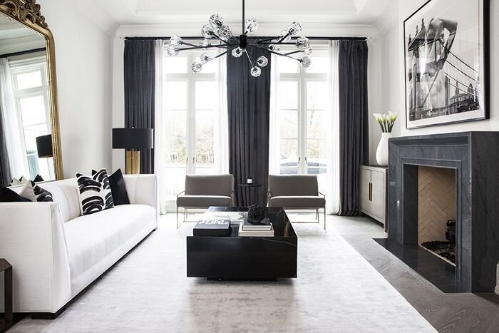
I hope you’ll forgive me, but I have to start with my favorite combination– black and white! Black and white is a play between dark and light. It’s all about contrast and is a classic color combination that you truly can’t go wrong with!
Black + Pink
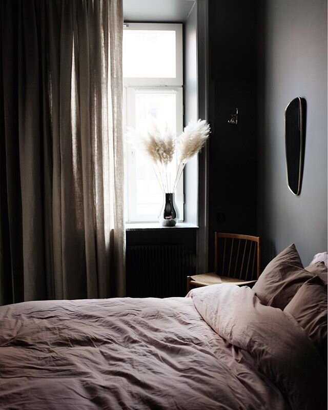
I know some of you are thinking, “Pink? Woah!”, but hear me out. Just like black, pink comes in an entire spectrum of tones and saturations. When I first paired black and pink, I simply added bright pink roses to add contrast to a black space. I also love a super light pink that almost looks beige. You can play with pink in your cushions, furniture, and flowers. Just have fun with it!
Black + Gold
Black and gold is a color combination I always associate with glamor. It makes me think about The Great Gatsby! It just feels so chic!
Please don’t think that just because you don’t consider yourself “glamorous” that you can’t incorporate black and gold! It can be gilded with high gloss and high sheen, but you can also achieve a more muted, natural look by pairing materials like smoked black oak with unlaquered brass that is worn and shows its age and patina. It has a completely different look and vibe! Black and gold can truly work for everyone!
Black + Green
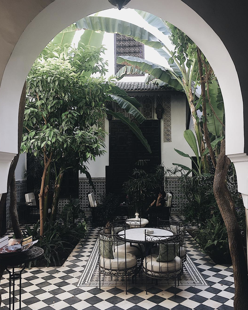
I think this is an unexpected color palette! I wouldn’t normally take green and sit it right next to black, but if you think about the different color tones and consider the addition of plants, it’s a total game changer!
Can you have a green room, green-painted room, or green-accessorized room in a home that’s mostly black and white? Absolutely! You’re taking a color mostly associated with sophistication and a color literally associated with life! When you put those two together, there is something very magical that happens!
So if you’re considering a black and white palette, don’t forget to add green! It’s what infuses life into a space and helps it feel natural, approachable, and alive! There’s something about bringing nature into your home that makes it feel grounded and balanced.
Playing with these combinations is all about what speaks to you and how you want to live in your space. What color do you want to talk about next? Let us know in the comments!
Watch the full video below!
<iframe width="560" height="315" src="https://www.youtube.com/embed/9E7bz-k7Wcc" title="YouTube video player" frameborder="0" allow="accelerometer; autoplay; clipboard-write; encrypted-media; gyroscope; picture-in-picture" allowfullscreen></iframe>


Leave a Reply