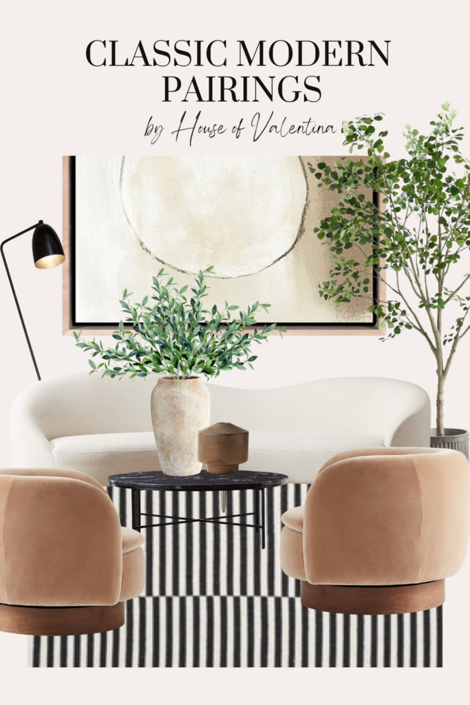
Whoa! What is happening?! We’ve been long time addicts to clean lines and symmetry but lately we have felt a force of movement all around us and it is shaking us to the core! Rounded sofas?! Abstract and amorphous coffee tables?! Anyone else freaking out over these new offerings? Do we ditch symmetry altogether?? Or run away from these trends? It’s a lot to process, but I’ve always been a let’s have our cake and eat it too kind of gal so I think you can be too!
Here’s our take on a classic, modern, and sophisticated living room with a little twist. It’s got the elements of long lasting design and yet it is sinuous and sensual and a little wild. It is perfection. I’m moving in. Anyone want to join me?

HERE’S THE BREAKDOWN:
The Furniture
The centerpiece of this design is the Curvo sofa from CB2. It’s iconic. Designed by the provocative Goop gals, this piece balances the elegance of Italian midcentury design with absolute cloud-like comfort. It’s the kind of sofa you can have a late night drink on with your significant other while dressed in a slinky silk chemise in black for the perfect contrast of materials, and yet wake up in the morning and have a cup of coffee while snuggling with the pup.
The Muir swivel chairs, also from CB2, balance out the other side of the space with their rounded shape and low backs, but offer one key feature that very few people ever turn down and that is the swivel action. Nothing delights the heart more than swiveling from a conversation with those of the sofa and an elegant “swish” to whomever is standing behind. It’s a total “daaahhhling!” moment that I for one cannot refuse!
Since you will obviously need somewhere to place your beverage of choice, the rounded marble top Irwin table will do the trick while looking absolutely fabulous and enticing all to come and stay a while. This little stunner was first designed in 1952, which just goes to show that age cannot define a girl. She’s a classic, only made more stunning with age and her simplicity allows the entire room to come together like a dream.
SHOP THE Design
The Artwork
It’s the little things that make the biggest punch, something my mom always told me at least, so don’t underestimate the power of your accessories. They will define the space and tell your eye whether you have done a good job or not. With that in mind, we’ve defied convention and given the space a moment of wild freedom with this abstract original piece by Dan Hobday (available at West Elm). It is the resounding backdrop, echoing the sinuous shapes of the room and pulling the colors together for the entire space.
SHOP THE DESIGN
The Accessories
Even the wildest girl needs to keep her feet on the ground, but she certainly doesn’t need to walk around on something boring! This striped rug is bold and graphic and gives the space some real flair and interest while the ficus tree adds balance with its soft earthiness. Fill your rough textured vase with more greens, add a bit of contrast with rust, and flick on the floor lamp, and suddenly this space is ready for everything from parties to quiet evenings in.
SHOP THE DESIGN


Leave a Reply