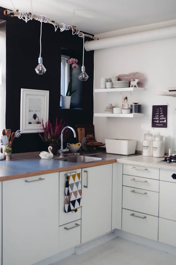
It’s very rare that a room ever stays exactly the same, unless it is a museum and things are only picked up, dusted, and put back into place. A kitchen, especially, sees some serious daily use, unless you are Carrie Bradshaw and use the oven to store your shoes… What a fabulous thought!
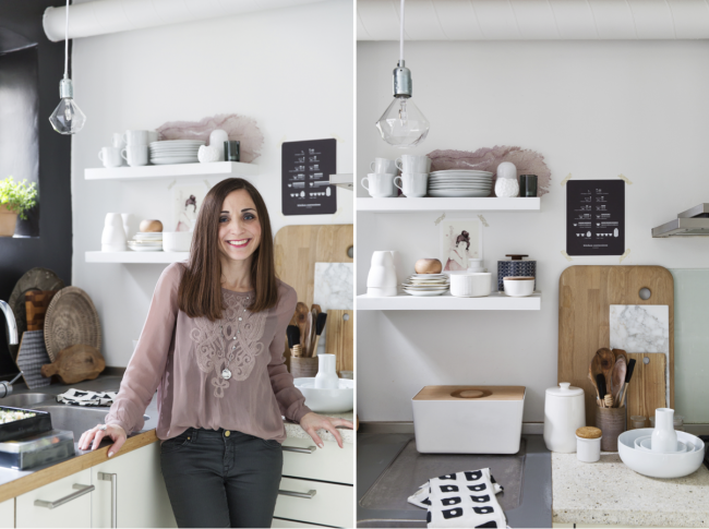
For those of us with a guilty conscious when we give our kids sandwiches for the 5th time in a week for dinner, the kitchen is going to see some action, and ours has definitely been counted among those these last four years. We started out with a fairly feminine feel to it, basically because I felt that if I was the sole chef in the house and my guy did nothing more than make a French Press, then I should get to have the space be any way I wanted. {smiles}
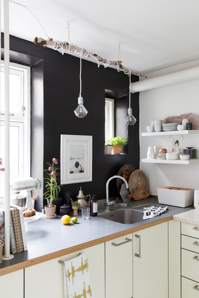
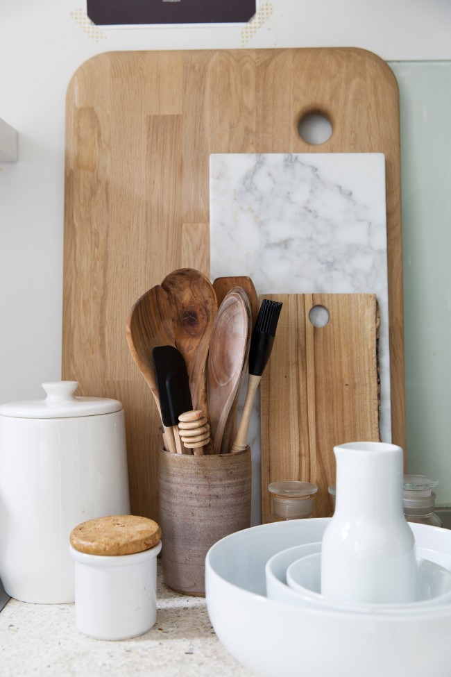
Then our kitchen went to publication in The Netherlands in a Dutch magazine called Ariadne at Home. (My sweet friend, Holly Marder, came and styled up the space with her magical touch!)
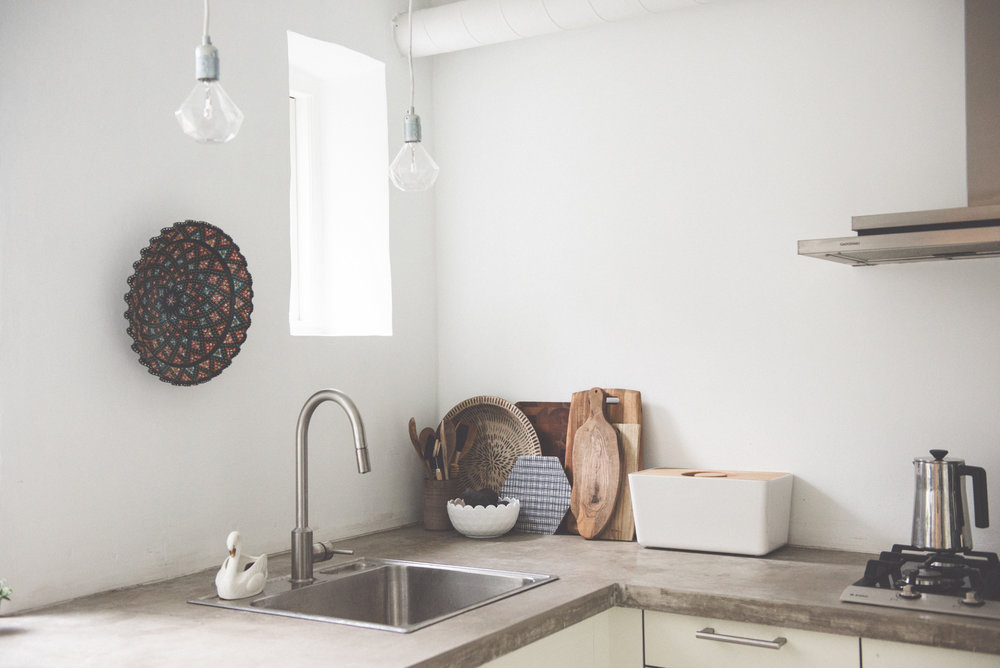
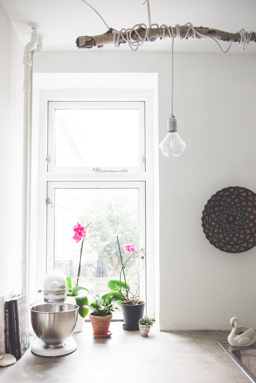
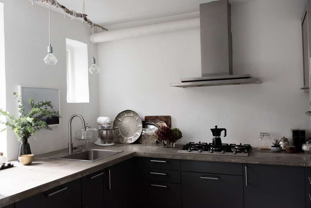
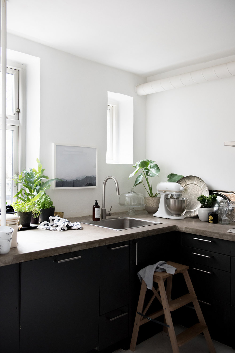
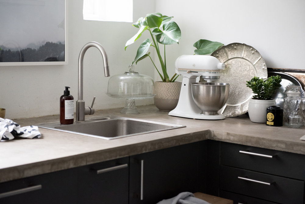
Then, while we were away in the US for 6 months, our land lord surprised us by installing concrete counter tops, painting the entire kitchen back to white, and throwing out my shelves. (He apologized.) Then, after begging the same land lord while batting my eyes and puckering up my red lips, he caved at let me paint the cabinets an amazing dark grey. I had to promise it would not ruin their laminate finish and I’m pretty sure he thought I was nuts (and clearly took pity on me since obviously there was something seriously wrong with my eyes and face) but it ended up looking FABULOUS. I’m STILL amazed by what a good coat or two of paint can do for a space.
Take a peek and see which phase of the Kitchen Before and After is your favorite!
THE FEMININE KITCHEN::
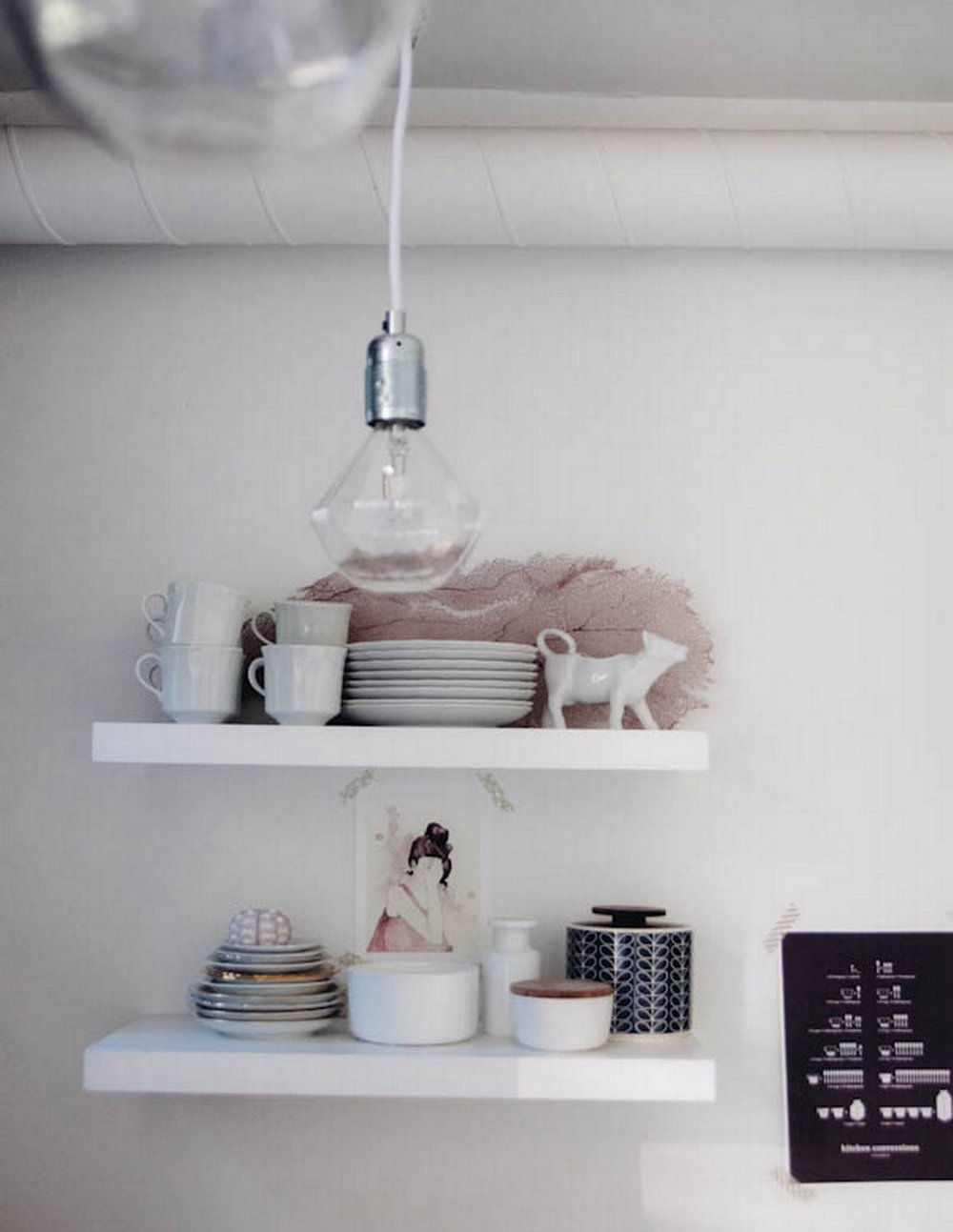
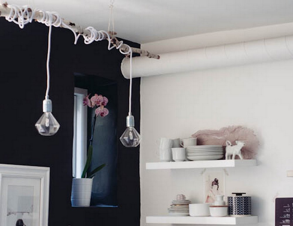
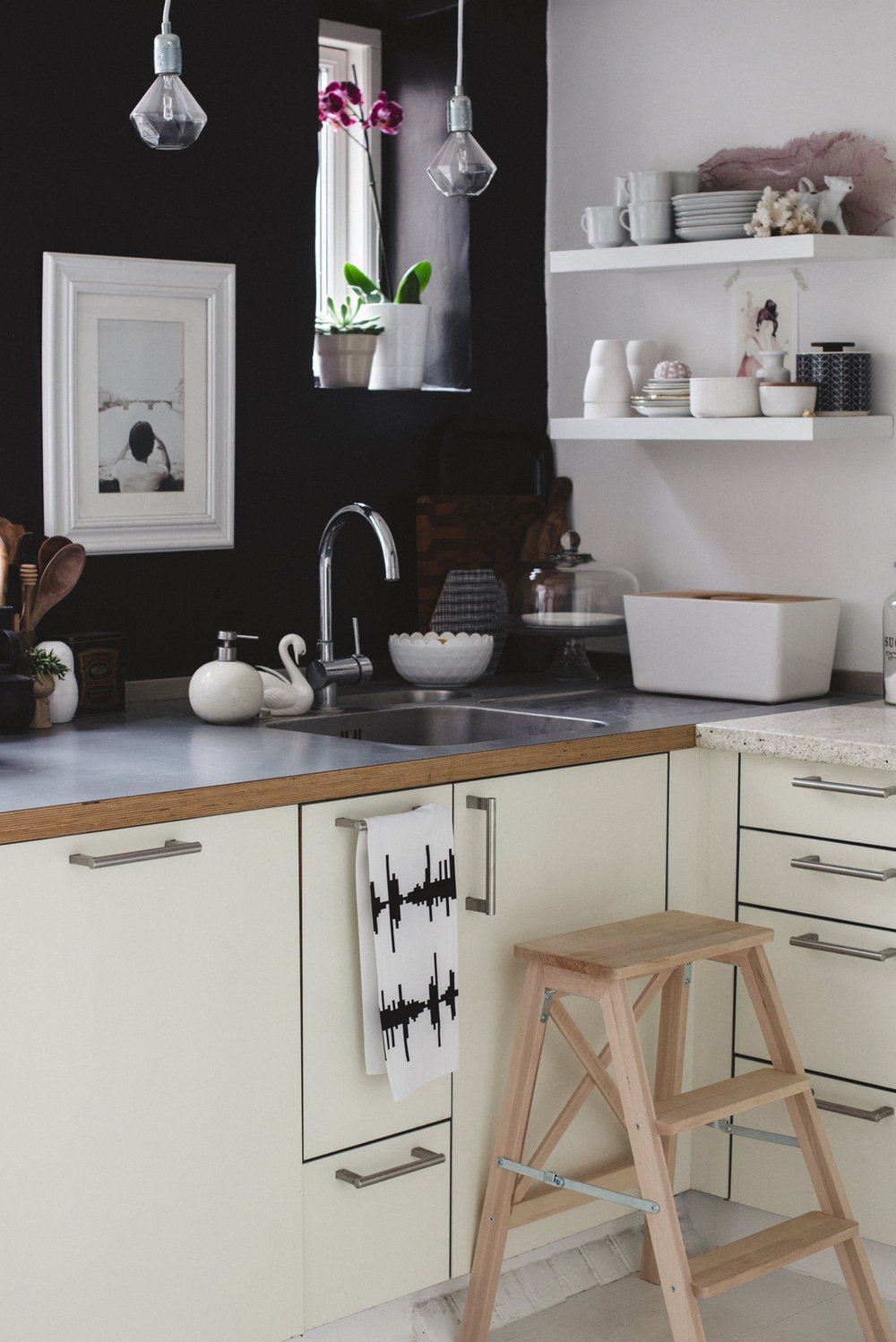
KITCHEN STYLED FOR ARIADNE AT HOME (Photography by Jansje Klazinga) ::
THE, “DUDE, WHERE ARE MY SHELVES? But thanks for the cool counter tops!” PHASE ::
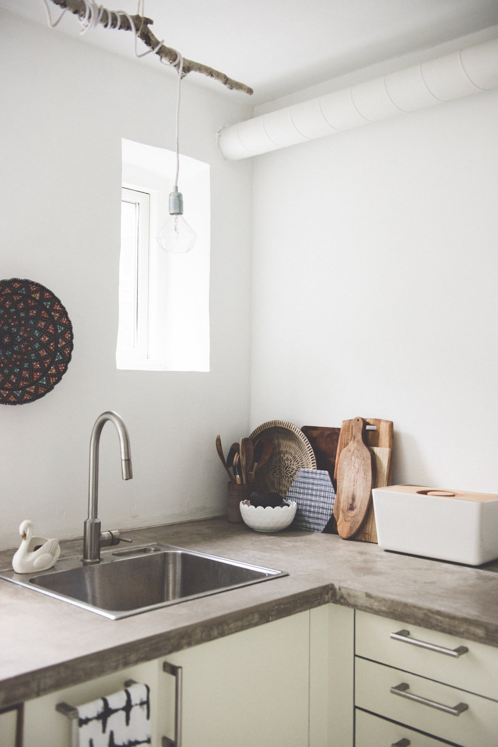
NEW CABINETS::
LAST WEEK ALIVE WITH GREEN! ::
__________________________
All Photography & Styling, unless otherwise noted, by Valentina Fussell


Beautiful evolution…i think the last one is definitly my favourite. I love the concrete counter tops and the grey cabinets match perfectly the white walls. What an inpiring place you have!
Thank you! It’s fun to realize how a space can be reimagined over time rather than a quick fix sometimes!
Beautiful evolution…i think the last one is definitly my favourite. I love the concrete counter tops and the grey cabinets match perfectly the white walls. What an inpiring place you have!
Thank you! It’s fun to realize how a space can be reimagined over time rather than a quick fix sometimes!
Beautiful evolution…i think the last one is definitly my favourite. I love the concrete counter tops and the grey cabinets match perfectly the white walls. What an inpiring place you have!
Thank you! It’s fun to realize how a space can be reimagined over time rather than a quick fix sometimes!
Beautiful evolution…i think the last one is definitly my favourite. I love the concrete counter tops and the grey cabinets match perfectly the white walls. What an inpiring place you have!
Thank you! It’s fun to realize how a space can be reimagined over time rather than a quick fix sometimes!
Hello! Love the concrete countertops, but definitely the grey cabinets made an impact.
Thank you so much! xx
Hello! Love the concrete countertops, but definitely the grey cabinets made an impact.
Thank you so much! xx
Hello! Love the concrete countertops, but definitely the grey cabinets made an impact.
Thank you so much! xx
Hello! Love the concrete countertops, but definitely the grey cabinets made an impact.
Thank you so much! xx