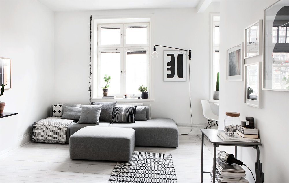
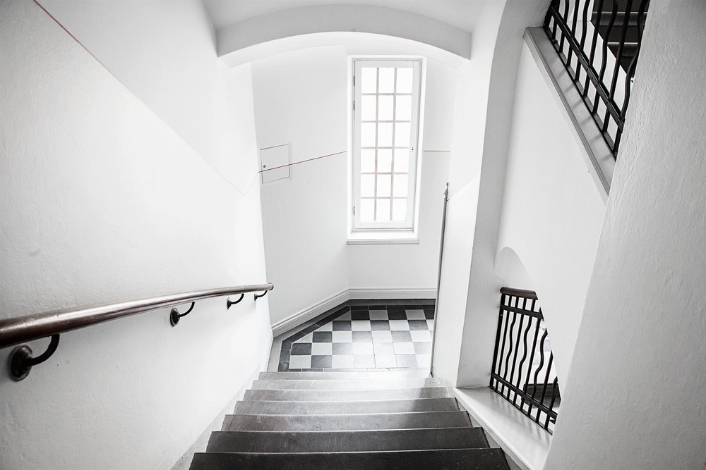
While the invention of color television is considered one of our recent history’s greatest accomplishments, I have an apparent obsession for all things black and white. I blame the Scandinavian winters. They are like a scene out of Frozen in which we have been cursed into a perpetual winter. Did the Scandinavians miss the message that, “Love thaws.” Or do we need a set of sister Princesses to help us with that?
Be glad you aren’t sitting next to me. You just missed a very compelling rendition of Olaf’s strange but oddly promising ode to “suuuuuuumeeeeerrrr!!”
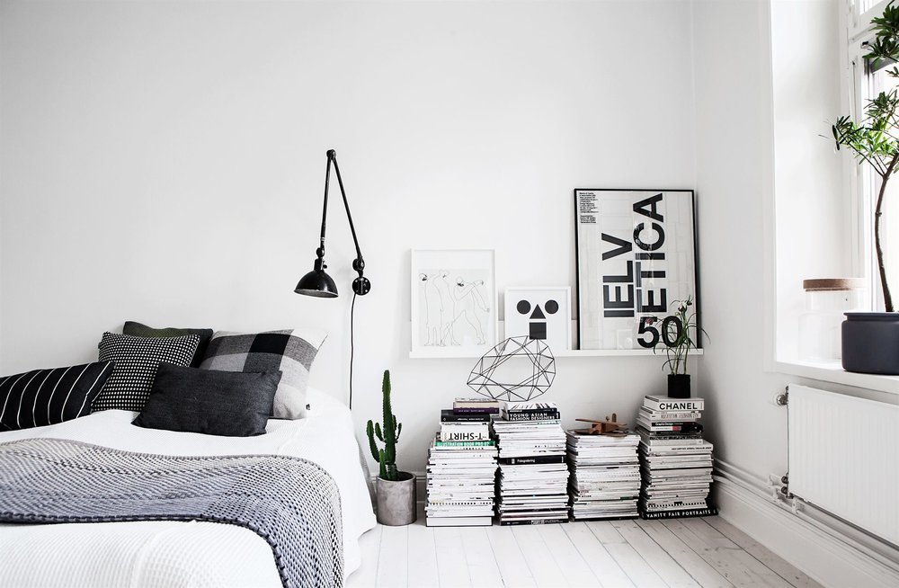
Before I wake my children and really freak out my husband, let’s chat about this cool monochrome home in Sweden. The bedroom bedside table is stacks of magazines and books, a feature I can definitely get behind and the industrial task light over the bed makes the room feel very urban. The plaid pillow and herringbone blanket make it very inviting, though, don’t you think? (This pillow + blanket wouldn’t hurt either!)
I always waver between wanting something warm, cozy, and natural and these stark sort of monochromatic homes. They offer such a serene and orderly escape, which can be tempting for any of us that faces a fast past and chaotic life.
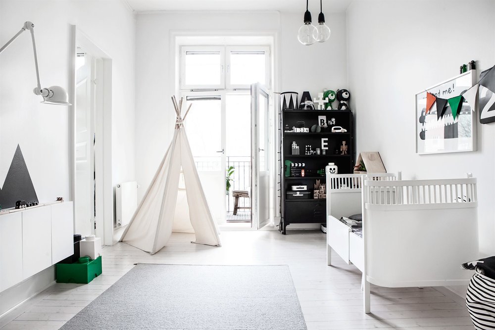
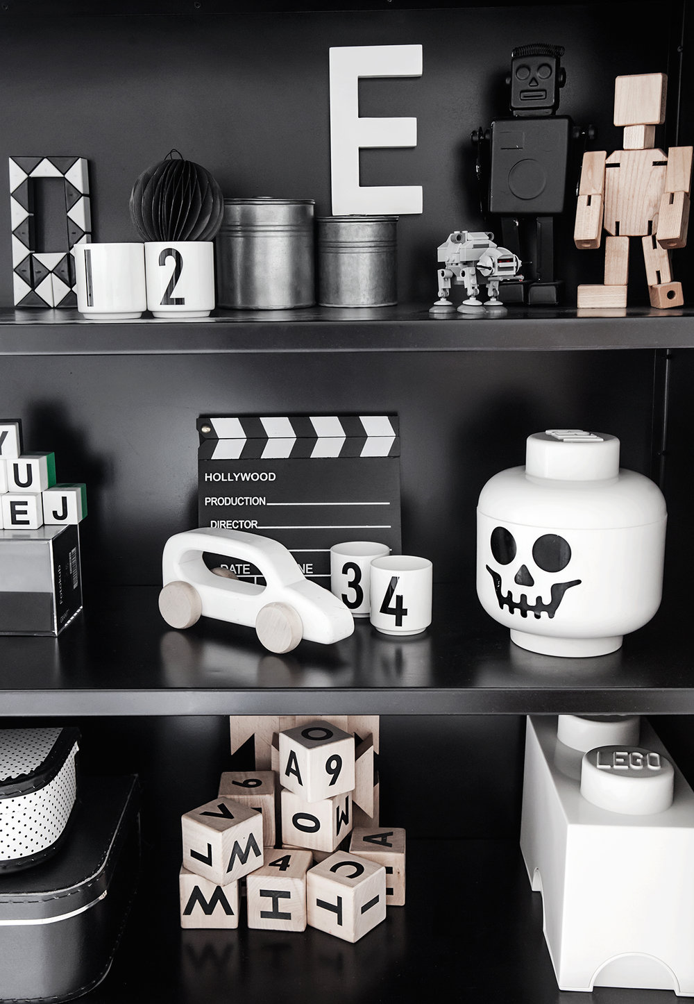
Perhaps that is one of the reasons that I love the kid’s bedroom in this home. It is fun and lively, but still tranquil and sleep inducing. We have many of the very same items in our boys’ bedroom so I may be a bit biased.
Take a peek and see what you think. No judgement if you want to sing along… because I don’t know about where you are, but it’s looking unlikely that we are going to getting much experience with warmth here.
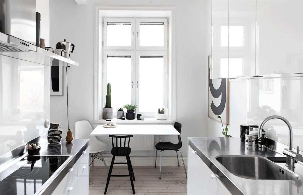
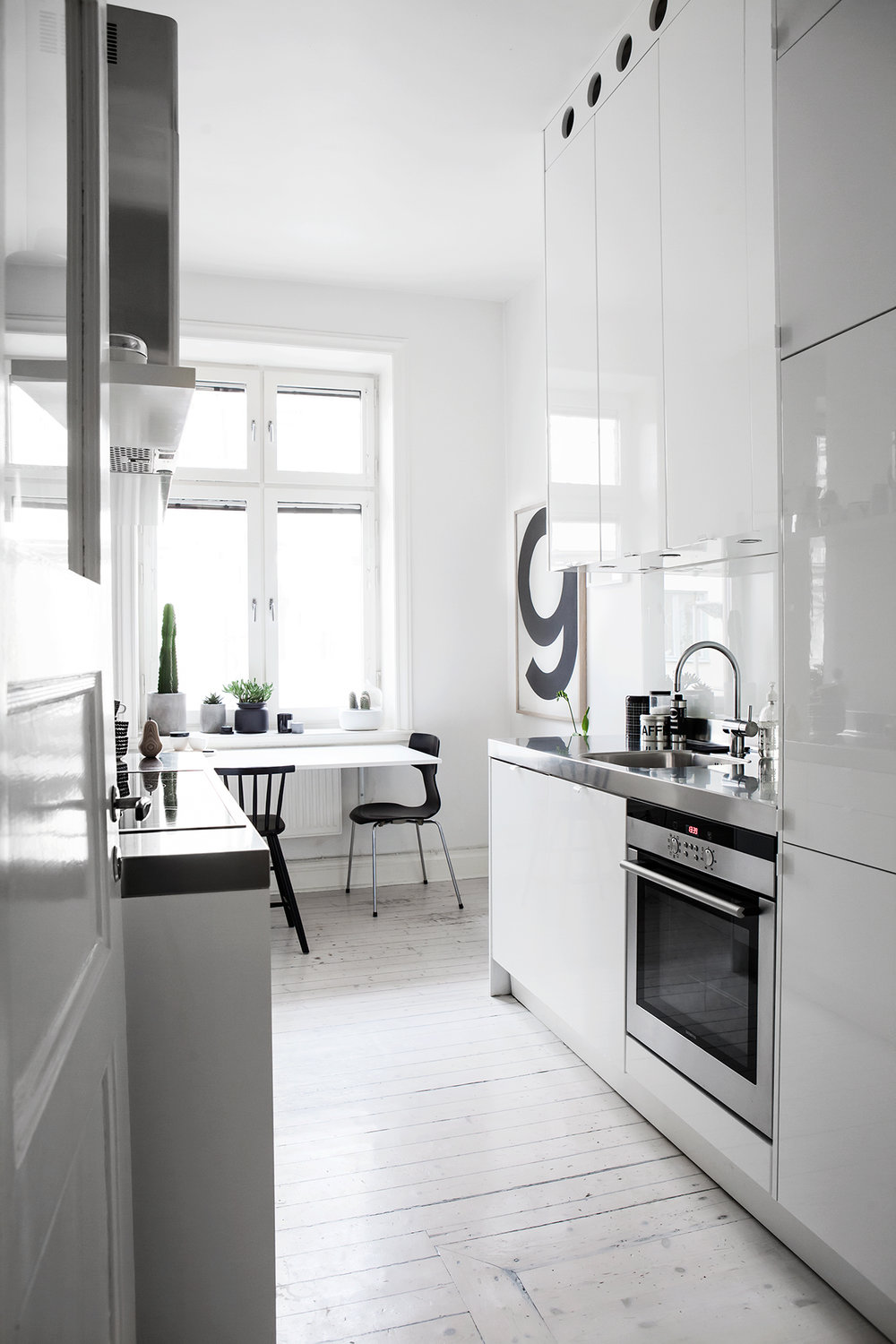
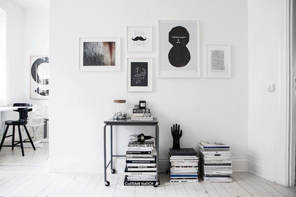
Photos via Fantastic Frank
__________________________________
Get a Similar Look with Some Of These Classic Faves:
Go Low and modern with the sofa for a cool and casual look. (But pick this one if you have a mom who complains about “getting back up.”) {Smiles}
Use Lego Storage Bricks
Can you ever go wrong with an Industrial Rolling Cart? They are versatile, moveable, and at instant awesomeness.
Whoa! Target’s doing Kids’ Rooms Like This? I want the teepee for myself… ahh the joys of having children to blame for purchases!


I agree about Scandinavian winters but the bedroom in this house irritates me because I have a problem with design that looks prima facie cool but is impractical when you consider it more closely. Would anyone want a swinging light right above their head in bed? Or a prickly cactus right next to the bed? Or stacks of (presumably loved & saved for a reason) magazines where a table to hold phone, book, kleenex, glass of water, should be? You couldn’t use those magazines as a table without risking damaging them. I see so much design where, at first glance, one says “wow, cool”. Then, on a second look, “Ok, that is very silly.”
Thanks so much for writing in! I agree that many of the homes are not really practical when you take them apart and I’m the first to admit as a stylist that many of the things done for photos are not practical. You obviously have an eye for design because most people tend to look at photos and overlook the smaller details (and sadly, a lot of times feel bad about their own spaces when they don’t feel like the images they see on Pinterest… something I am trying very hard to discuss here!!) In defense of the light and magazines… mine are very similar and I just sit stuff on the magazines or adjust the light as I need it, but you are SO right about the cactus! Ouch! LOL! I hope you will keep writing in! I LOVE hearing other’s perspectives on the spaces I post! xx