What is it about a home that can date it and make it feel like you hopped in a DeLorean? Today, I’m sharing the outdated trends that are putting a timestamp on your home!
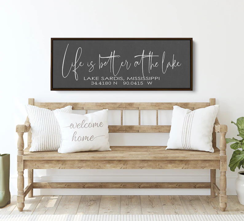
#1- Signage
It’s been a trend for so long– signs that tell us which room we’re in, where the house is located, or even how to behave. They had their day, but now they’re dated. Instead of signage, add a piece of artwork or even a sculpture! Do you like abstracts, landscapes? Shop at places like Pottery Barn, Crate & Barrel, or even Target and Walmart! Take out the signage and level up the sophistication!
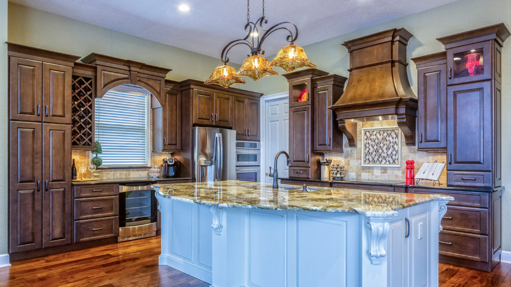
#2- Tuscan Look
My husband Jack and I used to have so much fun going to restaurants like Macaroni Grill just to feel like we had been transported to Italy. While the limewash faux finish is actually coming back in the style, the way it’s being done is much different than the Tuscan style of years past. People don’t want their house to look like it’s falling apart!
#3- Outdated Colors
Orange, burgundy, hunter green, and aubergine come to mind. While these colors can be done in a modern way, when done in the way they were done decades ago (again, think the Tuscan look) they just date your space!
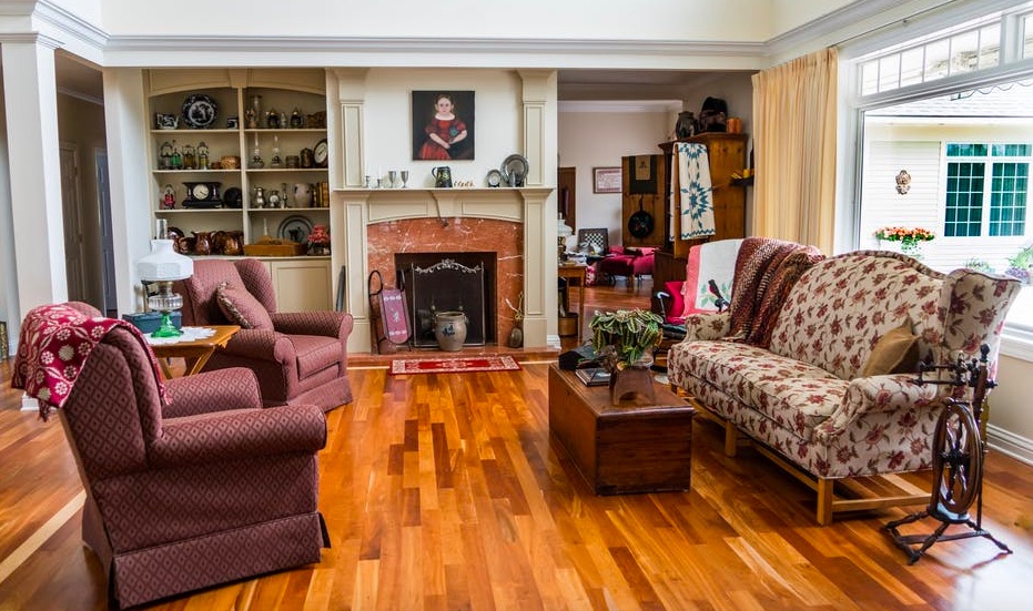
#4- High Gloss Floors
This issue comes up all the time with our clients when they’re refinishing their floors! High gloss floors were very popular up until a decade or two ago, but no one wants them anymore! Although it can be pricey, hardwoods can be refinished and I always recommend choosing a matte finish.
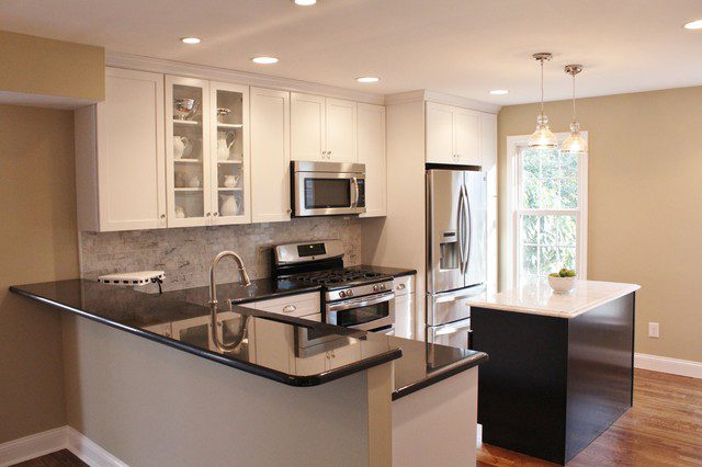
#5- Raised Counter Bars
I can’t tell you how often we remove raised bars from our client’s homes! These just aren’t practical or comfortable for most people– unless you happen to be super tall (unlike me). While there are ways a raised bar can be done in a more modern way, we just really aren’t seeing people gravitate toward that! There’s much more desire for a streamlined, clean kitchen that features a beautiful island with counter seating.
#6- Heavy Drapes
Even in traditional homes, I’m not seeing people do heavy drapes. Fear not though, this is such an easy fix! Just take them down! I know it can be hard to take down expensive custom drapes, but let go and let the light in!
#7- Frosted Light Globes
Jack likes to say that these are a remnant of the Starbucks cafe-inspired home design days. People had lights that put out a yellow or orange glow, but we don’t want this anymore! We want bright spaces! You can look at places like Home Depot to find light fixtures with clear glass.
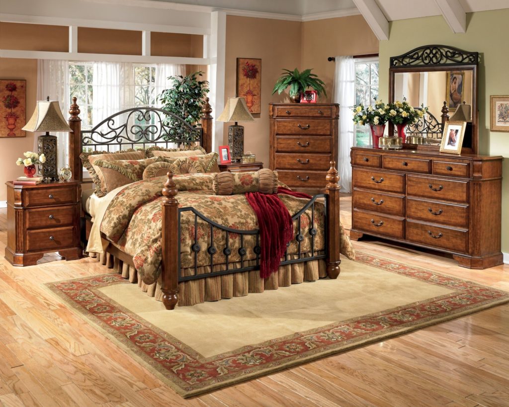
#8- Dark Wood Wrought Iron
This is another ode to the Tuscan style. These furniture pieces combined dark wood finishes with ornate wrought iron that often looked “scrolly”. Yes, that’s the official term! However, no one wants this anymore. I’d recommend looking at Pottery Barn, CB2, Amazon, and Wayfair to find pieces that will bring your space more up to date!
#9- Bed in a Bag
I know that a lot of manufacturers have attempted to recreate the bed in a bag that doesn’t look like that, but I’ve yet to see one worth buying! Personally, I don’t want all of those pillows! I don’t want pillows of all different sizes! Right now, we’re actually designing with pillows that are mostly the same size! Beds in a bag are just very mathematical feeling and I think most of us are ready for a more modern look.
If you already have a bed in a bag and don’t want to completely start over, you could just edit it down and create a more simplified look!
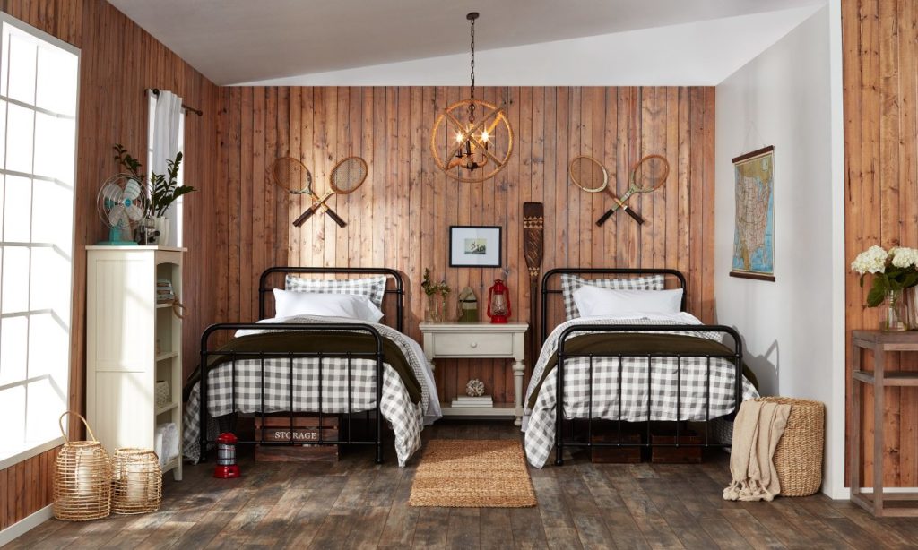
#10- Themed Decor
If you have oars holding up your curtains, we’re coming for you! All joking aside, we’re just seeing that themed rooms are not in style like they once were. Now, we want more practical decor that serves a purpose or just makes sense for the space! We’re tired of homes being overly decorated and we want better-curated spaces.
We hope these tips are helpful as you take some time to look around your home and find ways to update your spaces. What tip did you enjoy the most? Let us know in the comments!
Watch the video below…

signeage!!! I’ve always hated it.